


When exploring the provided type options, I found Akzidenz-Grotesk Bold Extended to be the most unique and full of personality. Its bold, extended forms felt inherently dynamic, which inspired the direction of the color palette.
My initial inspiration came from the world of motorsport, particularly the iconic McLaren orange. The speedy and energetic movement of Formula 1 embodied the spirit of "play" that I wanted to capture. However, ultimately, I chose a vibrant hot pink. Its playful, feminine character creates a compelling contrast with the typeface's bold, masculine presence.


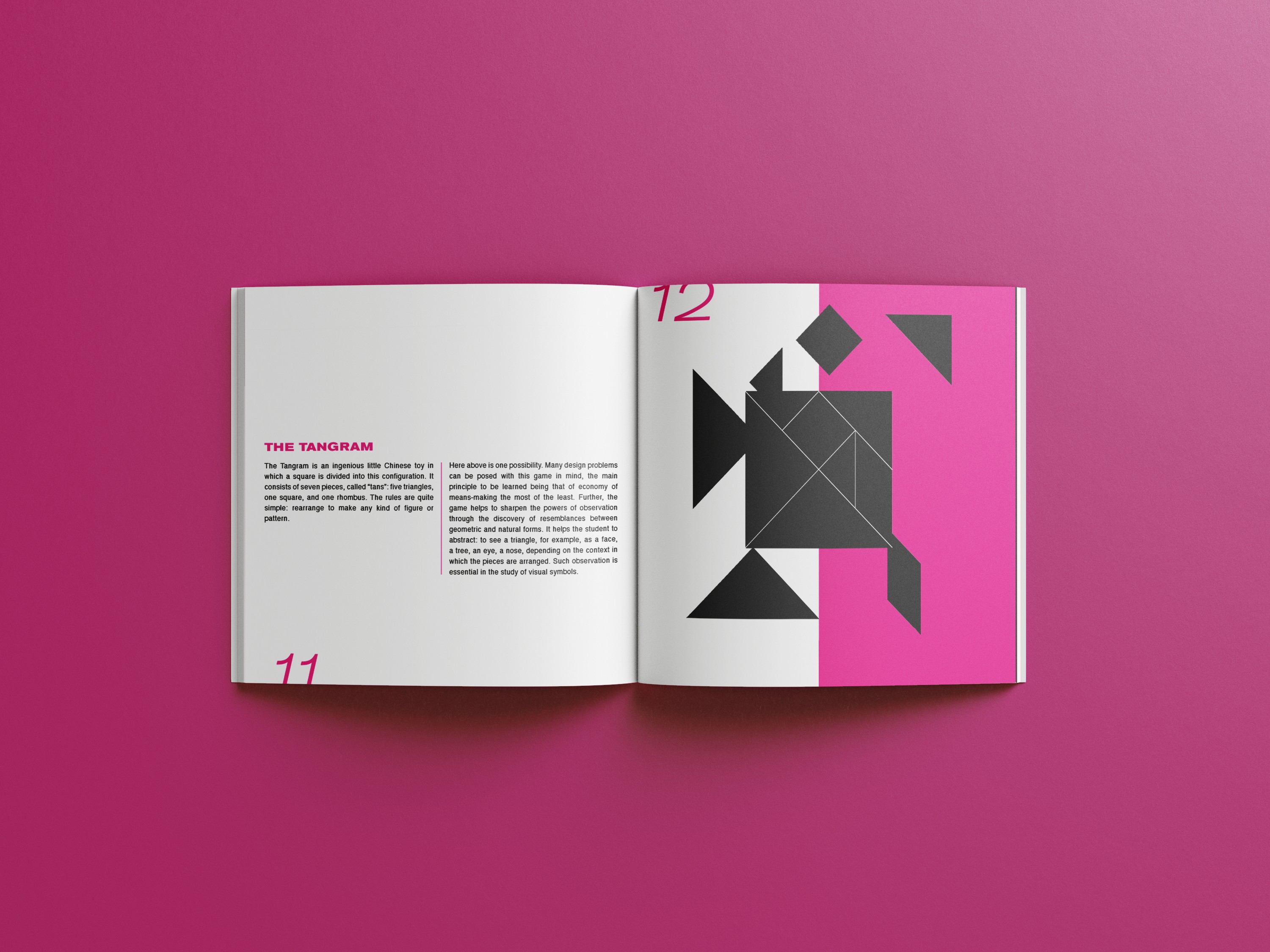
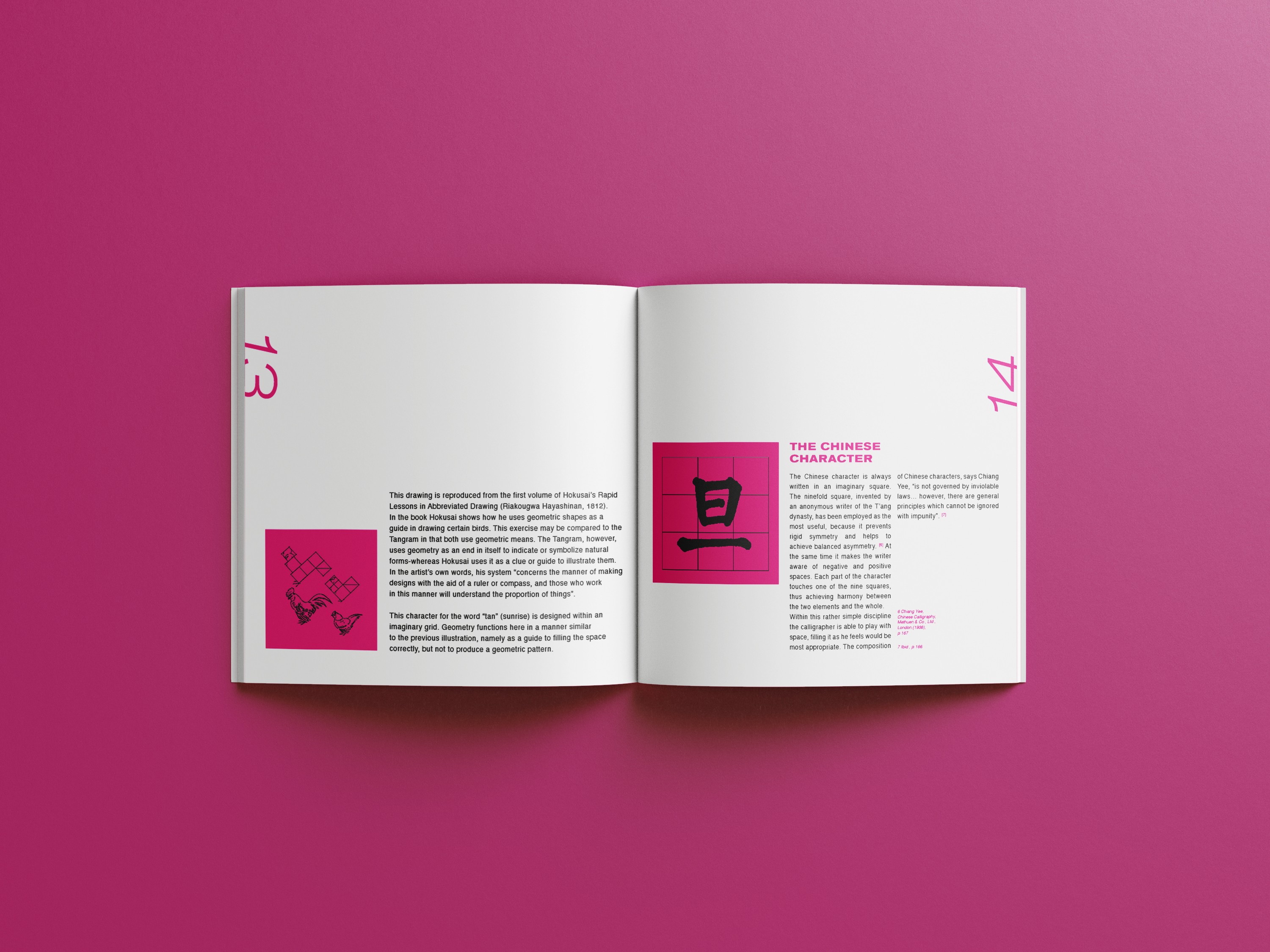
The central concept of the book was Paul Rand's idea of "play", which I wanted to reflect in the spot color choice. I chose a vibrant hot pink spot color to create an energetic visual identity that immediately captured and maintained attention. To balance the visual weight of the solid hot pink shapes, I mirrored the composition of the text or imagery across each spread, creating rhythm and cohesion throughout the book.
I explored the relationship between positive and negative space through typography, layout, spacing, and page numbers. To introduce movement, I designed page numbers that extend beyond the page as an additional graphic element. While each spread experiments with symmetry and asymmetry, a consistent typographic system and layout ensure each page individually looked like they belonged to the same book.



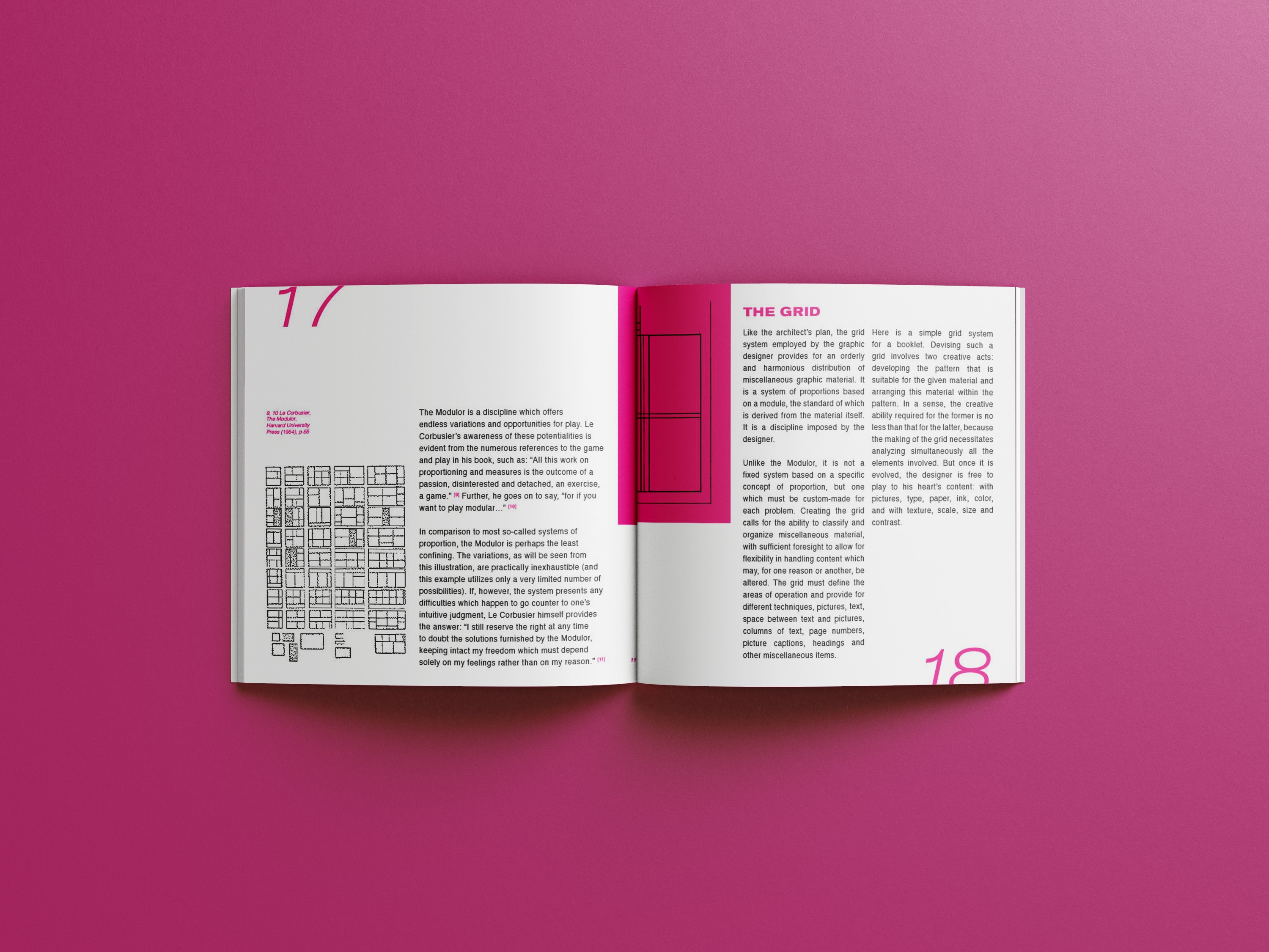

Reflecting on this project, I see opportunities to improve the consistency of the overall layout system. Some pages, particularly pages 5 and 6, pushed experimentation too far and began to feel more like standalone magazine spreads rather than pages within a cohesive book. Additionally, on page 16, I introduced a hot pink tab as a graphic element to hold text, but this visual device was not carried throughout the rest of the book, making it feel less integrated into the overall system.
Despite these challenges, this project was a great learning opportunity. I had never worked with this volume of text before, and it strengthened my understanding of balancing text and graphics. I learned how small typographic decisions such as avoiding ending a line with short words like “and”, can improve the flow of reading.