



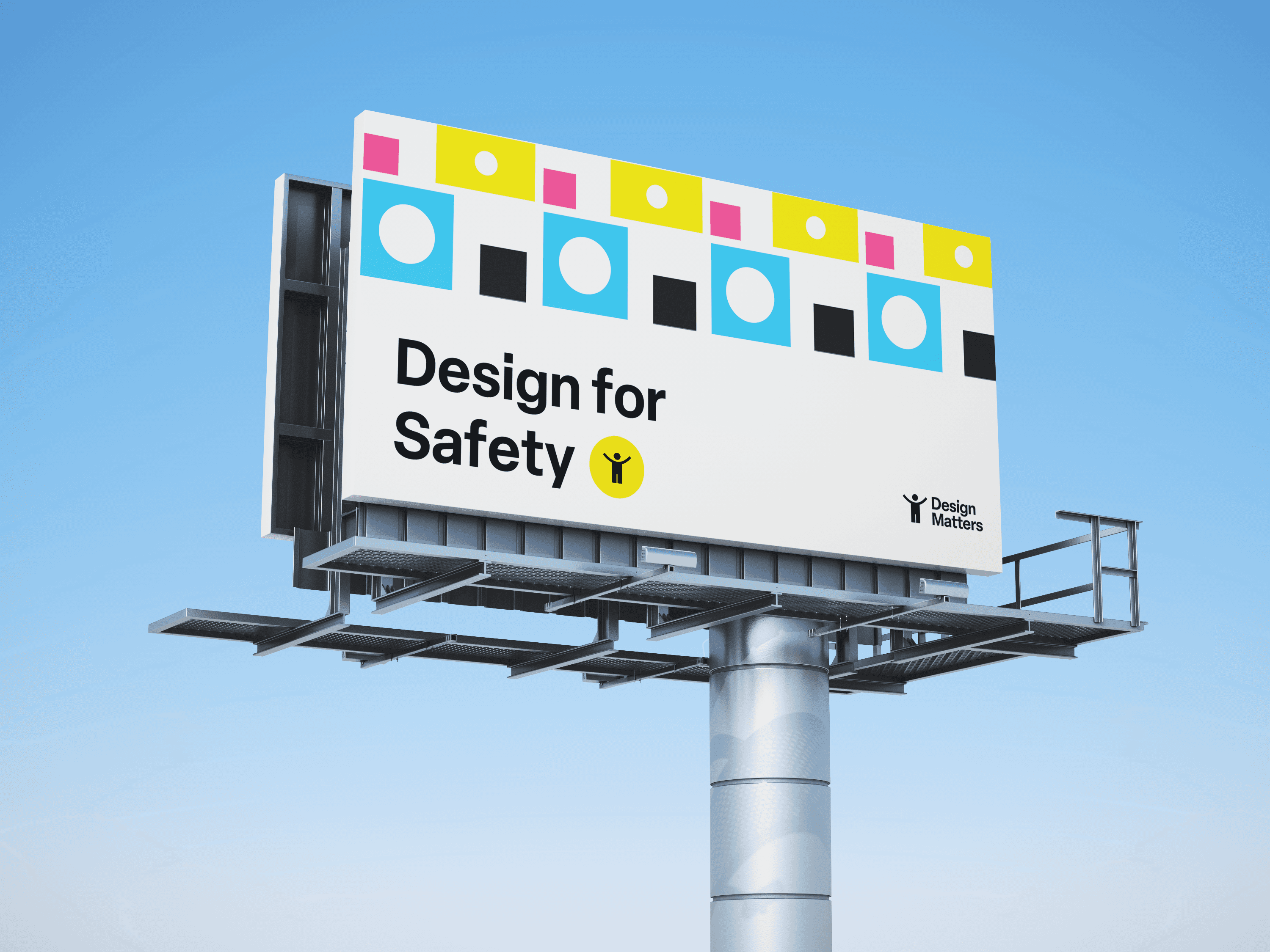
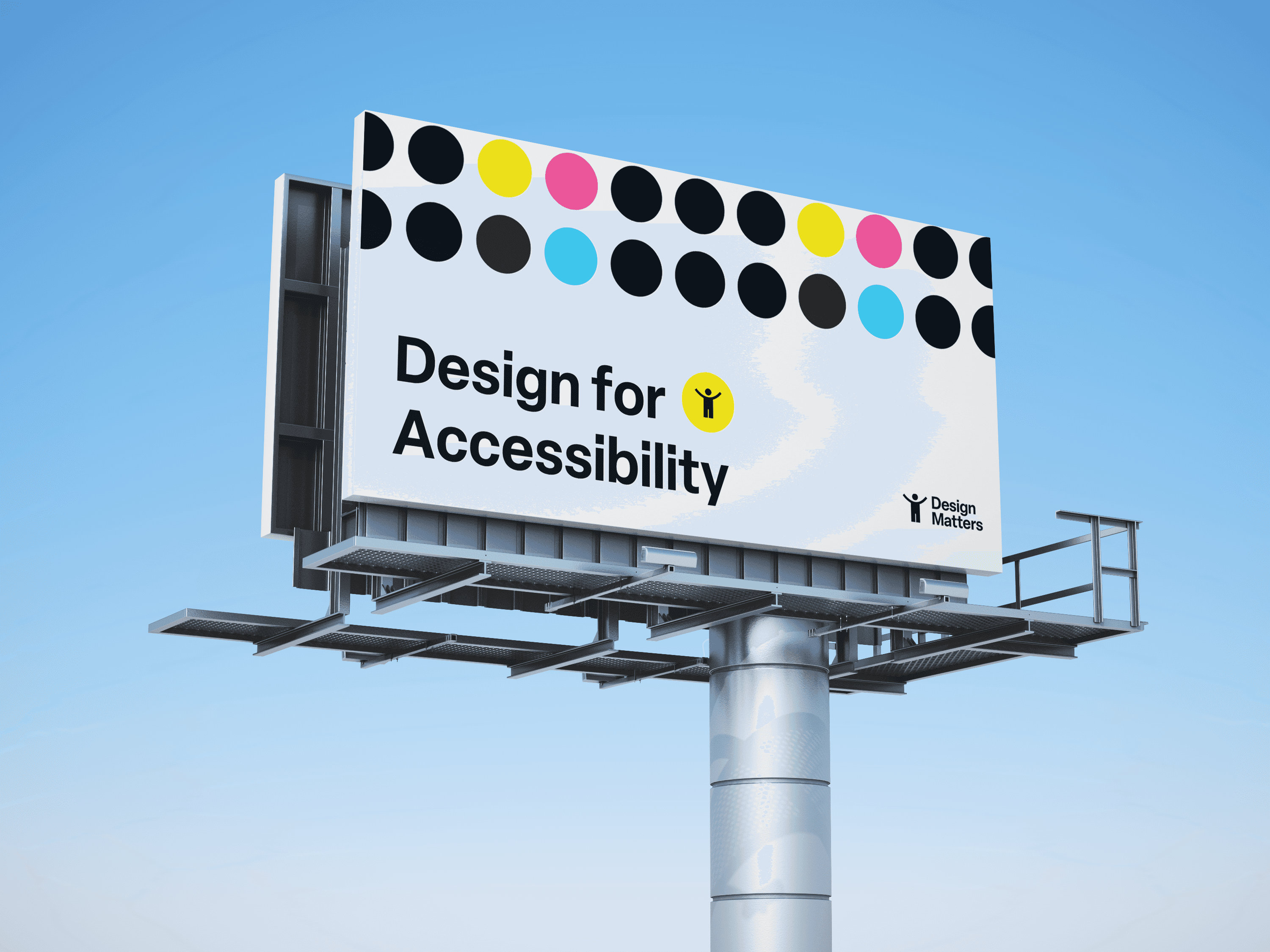


The element that could use the most improvement is the legible design sticker. I struggled with integrating the logo and supporting text in a way that respected the existing geometric language and visual system while maintaining a clear typographic hierarchy.
The final sticker design also needed to be scaled relatively large compared to the package size, making it less practical for application. If I were to revisit the design, I would simplify the sticker by using the icon portion of the logo rather than the full wordmark.
Edit (9/4/26): I have since redesigned the sticker and updated the collaterals accordingly.