


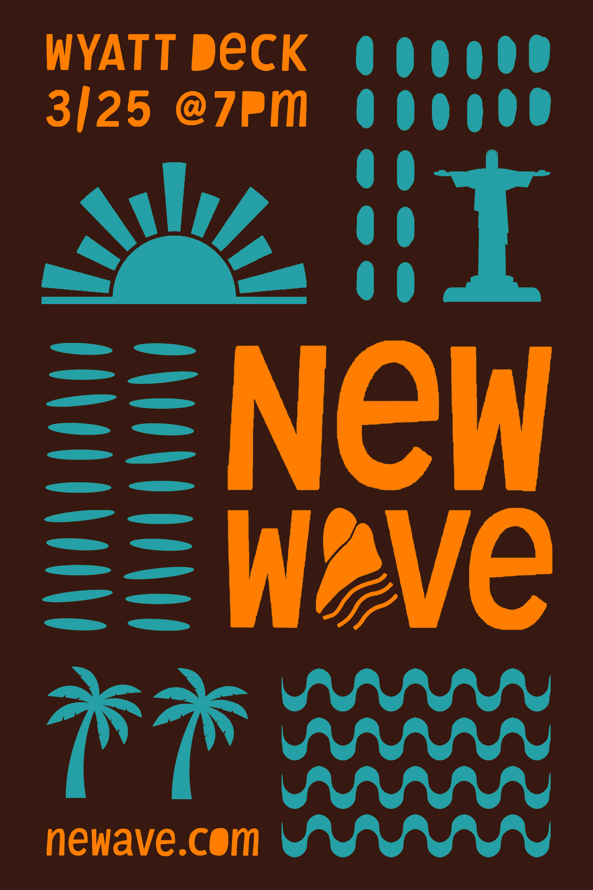
I wanted a strong sense of the performer's genre of music to come through the movement of the typography, colors, and graphic elements, something that was unclear in previous Lawntopia posters.
I explored handwritten typefaces that captured the vibrancy and passion of Isaiah Rashad’s music, but ultimately didn't find any that resonated. Instead, I hand-drew the typography, incorporating a distinctive human touch often missing from modern design. From there, I leaned into the organic qualities of the design by adding imperfect brush strokes and paint splatters to reinforce the handmade aesthetic.
I concentrated the paint splatters within the negative spaces of the composition, particularly on the right side, to balance the visual weight of the performer's hand, which naturally drew significant attention. This helped guide the viewer's eyes toward the key event details such as the date and location as the rest of the text already stood out with size.
