Rebranding bossa nova for the American youth.


Rebranding bossa nova for the American youth.
Rebranding bossa nova for the American youth.
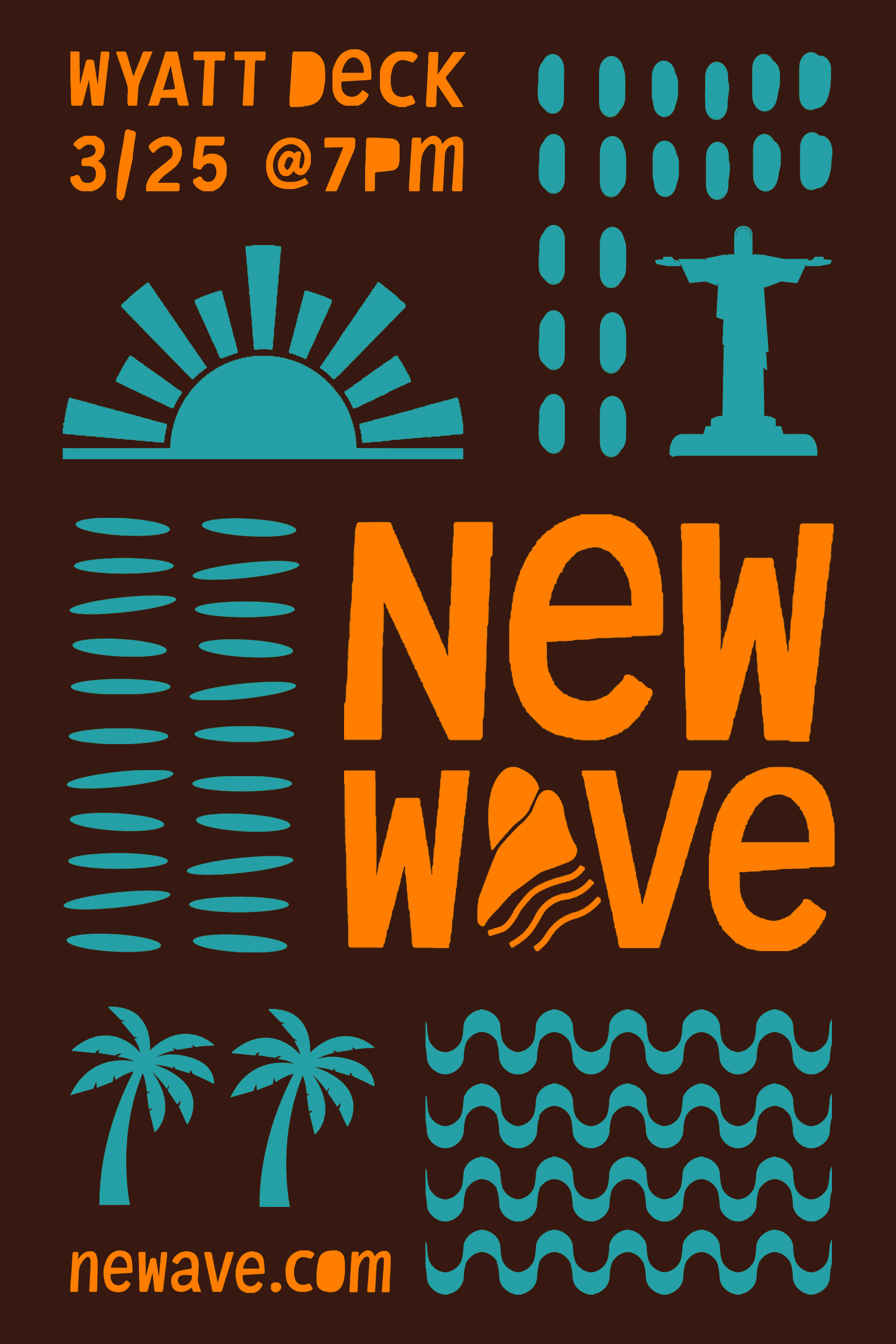
New Wave is an outdoor concert festival, celebrating bossa nova's cultural roots.
Send me an email
New Wave is an outdoor concert festival, celebrating bossa nova's cultural roots.
Send me an email
Project Description — New Wave (concept)
The project's aim was to create branding, social media, merchandise, and packaging for a concert event of choice.
Bossa nova’s identity in the US has been diluted into a nostalgic “elevator music” stereotype, disconnecting it from the cultural movement it emerged from. My research revealed its importance within Brazilian culture, inspiring a brand that pulls the genre back to its cultural roots and reimagines it for a younger American audience.
Category
Branding / Art Direction / Packaging / Naming / Copywriting / Research
Timeline
Jun 2024 - Jul 2024
Project Description — New Wave (concept)
The project's aim was to create branding, social media, merchandise, and packaging for a concert event of choice.
Bossa nova’s identity in the US has been diluted into a nostalgic “elevator music” stereotype, disconnecting it from the cultural movement it emerged from. My research revealed its importance within Brazilian culture, inspiring a brand that pulls the genre back to its cultural roots and reimagines it for a younger American audience.
Category
Branding / Art Direction / Packaging / Naming /
Copywriting / Research
Timeline
Jun 2024 - Jul 2024



The main challenge I faced was developing the logo. Initially, I was too focused on a literal interpretation of “New Wave,” exploring different ways to depict waves alongside typography featuring the event name. However, these early iterations felt expected and lacked the conceptual connection I was looking for.
In search of a stronger direction, I returned to the foundation of the project: New Wave was about reconnecting the genre with its cultural roots in the beaches of Rio de Janeiro. I wanted the logo to immerse viewers in the feeling of walking through a Brazilian beach by using an iconic symbol of the city. While the Copacabana Sidewalk pattern was an obvious reference, its familiarity made it feel less unique. Instead, I explored Sugarloaf Mountain as another recognizable landmark of Rio.
Alongside this project, I designed a process book documenting my work from the graphic design class in which it was created in. The book brought together research, explorations, and final projects completed over the 10-week course.
The main challenge I faced was developing the logo. Initially, I was too focused on a literal interpretation of “New Wave,” exploring different ways to depict waves alongside typography featuring the event name. However, these early iterations felt expected and lacked the conceptual connection I was looking for.
In search of a stronger direction, I returned to the foundation of the project: New Wave was about reconnecting the genre with its cultural roots in the beaches of Rio de Janeiro. I wanted the logo to immerse viewers in the feeling of walking through a Brazilian beach by using an iconic symbol of the city. While the Copacabana Sidewalk pattern was an obvious reference, its familiarity made it feel less unique. Instead, I explored Sugarloaf Mountain as another recognizable landmark of Rio.
View Full Process on Behance
New Wave is an outdoor concert festival, celebrating bossa nova's cultural roots.
Send me an email
New Wave is an outdoor concert festival, celebrating bossa nova's cultural roots.
Send me an email