


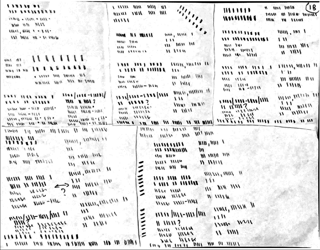
I began the process by storyboarding different layout possibilities of the text. Since the poster is so content-heavy, I wanted to explore more experimental layouts.
While this process was helpful for visualizing different directions and comparing layouts side by side, it was far too tedious and time-consuming. Moving forward, I would digitally create layout options.


The two images above provide a direct comparison of my two final drafts. The draft on the left served as a composition exploration of all the ways I could create concise graphic elements out of chunks of information like the date.
I didn't end up choosing this version because it combined too many competing ideas to the point of clashing compositionally. While the individual elements had potential, the overall design lacked a clear art direction and cohesive visual system.

Using the font as the foundation of the poster design proved to be a strong conceptual starting point.
The grid system allowed me to organize the information into digestible, legible sections while transforming the font limitation into an opportunity to reflect one of the lecture's key themes: clear typographic hierarchy. By relying on structure and scale, the type itself became a visual representation of the relationship between information and design.